May 3, 2024
Improvement
Component updates
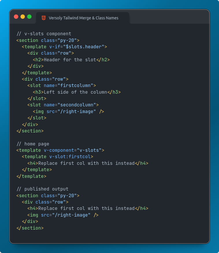
This update focuses on enhancing component development and management within the visual editor. Key improvements include slots, better class name handling, and streamlined workflow for components.
Component Slots
- Added support for named slots, allowing you to pass content to specific areas within a component.
- Implemented conditional rendering of slots based on props or state.

Component Class Names
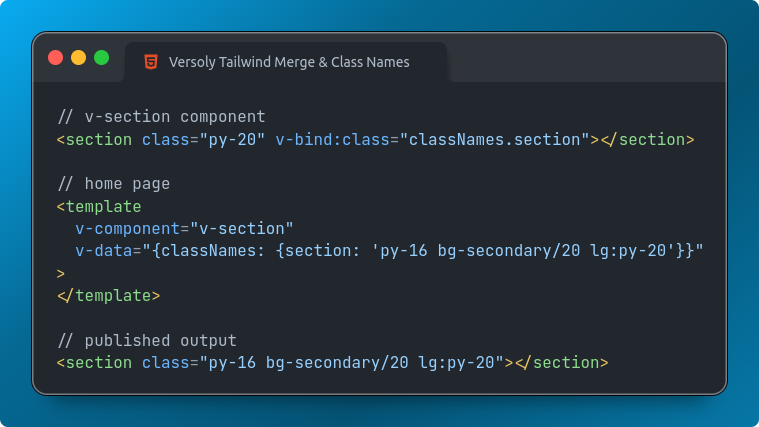
- Integrated
tailwind-mergeandclsxlibraries for better management of component class names. - You can now dynamically merge class names based on props or state.

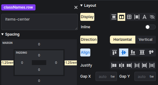
- It is possible to edit component property class names using the visual editor.
- The visual editor will show what styles are already applied to the element inside the component.

Component Folders
- Introduced folders for better organization of components.
Component Categories
- You can now use the default Versoly categories or create new ones for better organization and discoverability of components.
- Components with a category will be shown in insert layouts.
Component Usage
-
Easily find where a component is being used such as a page or nested inside another component. This can be accessed inside component settings.
Property Groups
- Components now support property grouping, making it easier to manage and organize props.
- You can create custom property groups or use predefined groups.
Visual Mode Property Visibility
- Added the ability to show or hide component properties based on the current Visual mode (e.g., Design, Developer, Content).
- This feature allows for a more streamlined and focused UI for different use cases.
Add Component Properties Faster
- Implemented a new workflow for adding properties to components directly from the element options panel.
- This streamlined process saves time and improves the overall developer experience.
Examples
- Updated Versoly examples website with new examples showcasing the latest component features and capabilities.
Did we miss something you would like adding? Feel free to request it using live chat or inside the visual editor.