Cloneables Manager
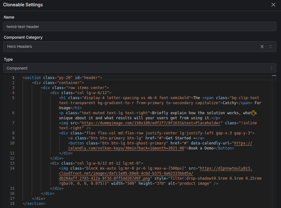
We've updated the cloneables manager to allow you to create, edit and delete cloneables easier and faster.
Cloneables can be reused across project and workspaces. They speed up building especially for freelancer and agencies who build multiple sites that are similar.
Versoly is just HTML, this means you can copy elements from one site and paste them into another site using the same site collections variables. This is useful if you have a section with many for loops, conditional statements and connected variables.
Create
When creating a cloneable you can select it's
- Name
- Component Category
- Type
The name allows you to search for it in cloneables manager, insert element and insert componet.
The component category will allow it to be shown in insert component. It will be shown at the top by default to easily find.
Type has component, page and layout. Component is used for insert components and can be added to any page. When a page is empty you can set it to a page template or cloneable.
Edit
When editing a component from the cloneables manager you can edit
- Name
- Component Category
- Type
- HTML
Name, component category and type are the same as the above and can be easily edited.
HTML can be copied, pasted and edited. For example if you decide to add a background to an element and want that to become the default for the cloneable you can copy the code and paste it into the cloneables manager.
Responsive Typography Editor
We've added a new responsive typography editor inside the theme manager. It provides a powerful and intuitive way to create, manage, and preview typography classes for your website.
With this tool, you can easily add, edit, and delete typography class names, combining them with Tailwind utility classes for precise and maintable styling control.
Typography class names
- Easily create new typography classes with custom font sizes, weights, and styles.
- Modify existing typography classes to suit your design needs.
- Remove unnecessary classes to keep your codebase clean and organized.
Tailwind utility classes
- Combine typography classes with Tailwind's utility classes for more granular control over text styling.
- Mix and match utility classes like text colors, letter spacing, and more.
Breakpoints, variant states and dynamic class names
- Add, edit and remove breakpoints from a class name.
- Variant states such as hover, focus and dark can be controlled visually as well.
- Dynamic class names can be used for semantic class names that have multiple colors such as primary and secondary.
Preview the responsiveness on mobile, tablet, laptop and desktop
- See how your typography classes will look across different screen sizes and devices.
- Ensure your text remains legible and properly formatted on all viewports.
- Preview with header and footer sections to see how the class name works with other elements.
Text input for class names
- A second way to edit class names is using a text input instead of visually.
- Quickly copy and paste class names directly from the input field.
- Avoid mistakes when applying classes to your HTML elements.
Component updates
This update focuses on enhancing component development and management within the visual editor. Key improvements include slots, better class name handling, and streamlined workflow for components.
Component Slots
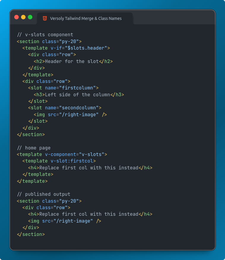
- Added support for named slots, allowing you to pass content to specific areas within a component.
- Implemented conditional rendering of slots based on props or state.
Component Class Names
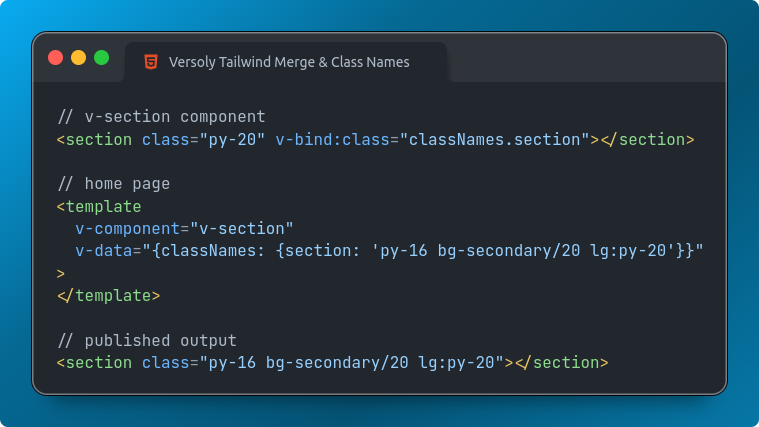
- Integrated
tailwind-mergeandclsxlibraries for better management of component class names. - You can now dynamically merge class names based on props or state.
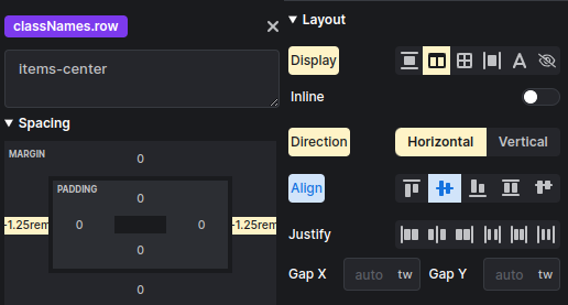
- It is possible to edit component property class names using the visual editor.
- The visual editor will show what styles are already applied to the element inside the component.
Component Folders
- Introduced folders for better organization of components.
Component Categories
- You can now use the default Versoly categories or create new ones for better organization and discoverability of components.
- Components with a category will be shown in insert layouts.
Component Usage
-
Easily find where a component is being used such as a page or nested inside another component. This can be accessed inside component settings.
Property Groups
- Components now support property grouping, making it easier to manage and organize props.
- You can create custom property groups or use predefined groups.
Visual Mode Property Visibility
- Added the ability to show or hide component properties based on the current Visual mode (e.g., Design, Developer, Content).
- This feature allows for a more streamlined and focused UI for different use cases.
Add Component Properties Faster
- Implemented a new workflow for adding properties to components directly from the element options panel.
- This streamlined process saves time and improves the overall developer experience.
Examples
- Updated Versoly examples website with new examples showcasing the latest component features and capabilities.
Did we miss something you would like adding? Feel free to request it using live chat or inside the visual editor.
Page and component tabs in the visual editor
We've introduced a new tabbed interface in the visual editor for better organization and navigation between pages and components.
Tabs allow you to easily switch between different pages & components instantly inside of your project
Versoly Playground
We've introduced a new Playground Mode that allows you to experiment with your website projects in a secure, shareable environment.
With Playground Mode, you can:
Shareable
You can easily share the Playground URL with freelancers, team members, or anyone else you want to collaborate with. No sign-up or account creation is required for them to access and view your project in Playground Mode.
Debug
Playground Mode provides a perfect environment for debugging and troubleshooting your website projects. You can make changes, test different scenarios, and experiment without affecting your live website.
With Playground Mode, you can freely explore new ideas, collaborate seamlessly, and ensure your website projects are thoroughly tested before going live.
Secure mode
Creates a secure URL that only those who are given the link to can access. This can be reset if required.
Fixed URL
A fixed URL is useful if you're creating a project where you want anyone to be able to access it easily. It can be disabled.
Features
- Add, view and edit pages
- Add, view and edit collections
- Add, view and edit collection items
- View forms & form scripts
- Access code editor
- View on-page SEO panel
Xray Mode
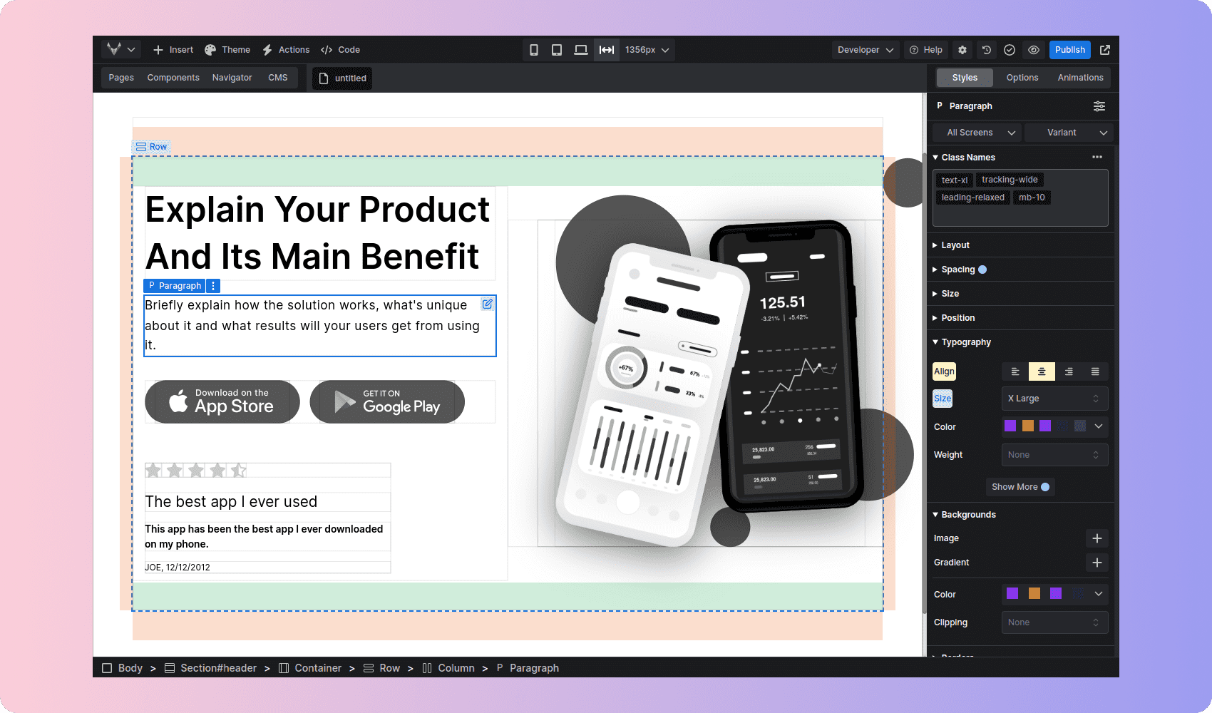
The new Xray mode allows you to easily see the element size and borders. It can be useful when you have many elements that overlap or are absolute positioned.
You can also check the margin and padding of any element by hovering it.
Scroll to selected element on code editor and navigator
When editing a large page or component it can be difficult to find the element you want in the code editor and navigator.
This update auto scrolls to the selected element when the code editor or navigator is open.
Non-technical mode
Non-technical mode has been made simpler by removing advanced features and reorganizing the elements panel.
It is now clear what mode you're using and can easily swap between non-technical mode for content editing and designer mode for advanced design & structure changes.
Add or duplicate collection items in the visual editor
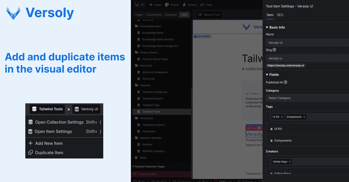
After allowing customers to easily edit item and collection settings in the visual editor it became clear the next step was adding new items and duplicating items to improve the workflow even more.
Click any element then in the top navbar you will be able to click the collection and select from the dropdown add or duplicate item.
Edit collection items in the visual editor
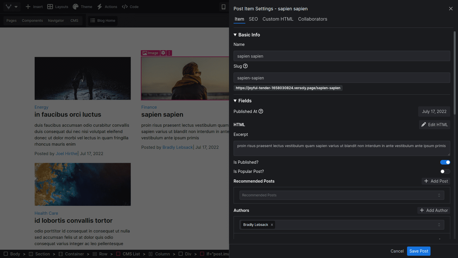
Editing and previewing collection items workflow before the ability to edit them in the visual developer was complex and could be confusing for new customers.
You can now easily edit collections and items inside the visual developer by double clicking an element that is linked to an item. This also works for elements inside a collection list.
Along side this update we added the ability to view and select related collection pages and components. This will make it faster to navigate to the right place.
Publishing was also cleaned up, you can now publish an item from the visual developer as well as the CMS text editor.
Shortcuts also allow you to quickly access the collection and item settings.
- shift + { for collection settings
- shift + } for item settings
Slider & Swiper JS
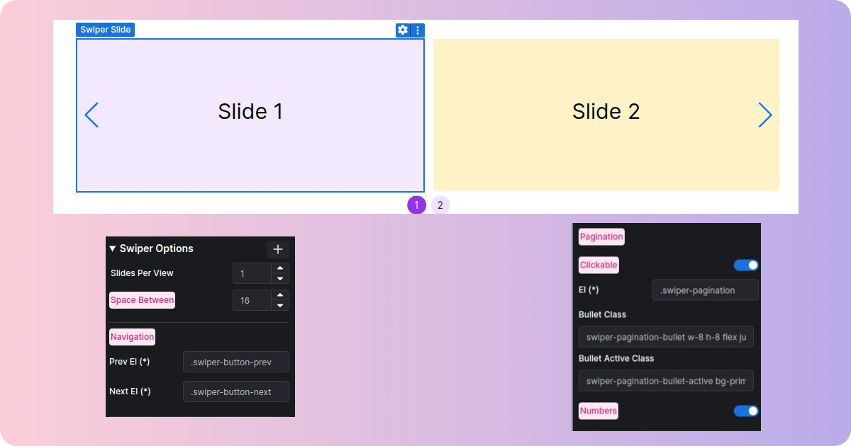
Sliders are popular for testimonials and show casing work. After a lot of demand we decided to add them and use a popular open source JavaScript library to give customers a lot of flexibility.
We use Swiper JS and it comes packed with built-in features such as:
- Pagination
- Navigation
- Responsive breakpoints
- Grid
- Parallax and more advanced animations/styling
As always it is easy to use to flexible. You can start of with the default settings and if you need to customise it you can do so with the option settings.
Emmet Support

Being able to build and launch sites fast is one of the main focuses of Versoly.
Emmet has allowed developers to quickly scaffold HTML structures since 2008.
It comes packed with features to add classes, ids and multiple elements at once. Currently the UI correctly shows 1 element with classes, ids and data attributes. However it supports the full library of Emmet.
A few quick examples of emmet syntax and what it will add to the HTML:
- .col - <div class="col"></div>
- section.py-24 - <section class="py-24"></section>
- section#emmet-id.py-24 - <section id="emmet-id" class="py-24"></section>
Emmet have a great cheatsheet on their site that is worth checking out.
Google docs copy and paste
A lot of you use Google docs to write blog posts and other content. Copy pasting it into Versoly requires manual editing to make sure the formatting is correct.
A year ago we made a lot of updates to clean the HTML and make sure features like lists and images worked when copied across. But there were still some issues.
We have added auto formating for
- All links are now set to new tab
- Removed extra paragraphs around images
- Advanced formatting for images and lists to edit easier
- Added captions to images pasted in
- H1 are converted to H2 for SEO reasons
We're always looking to improve this feature so if you have any requests send them across.
Components
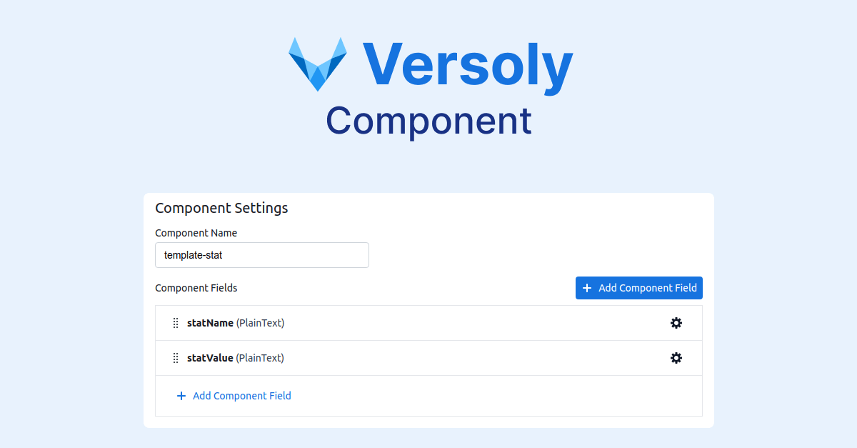
Reusable components allow you to make changes once and have them update everywhere.
Components can also be nested inside each other making them very powerful. As an example a card component with nested tags.
Adding attributes to a component allows you to use the UI to make changes to the component without code.
Style Guide + UI Kit
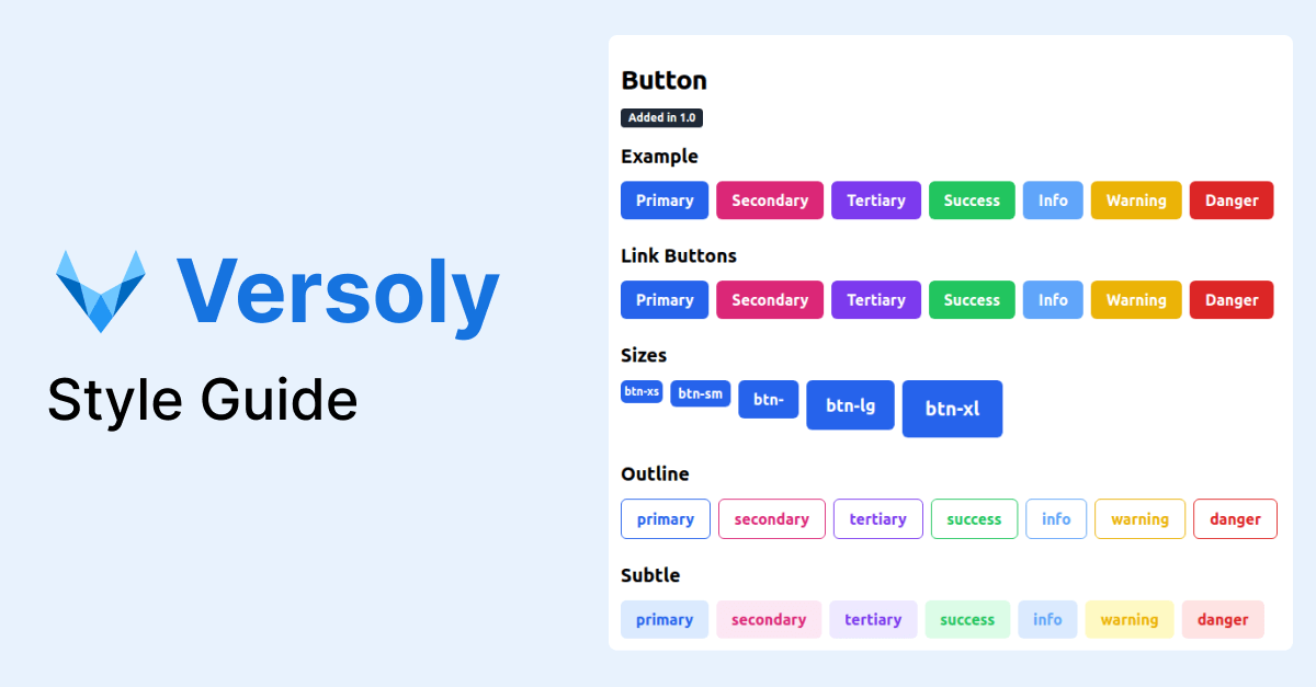
Every landing page and website has a style guide. It is usually hidden away and hard or impossible to access.
We decided to make the style guide a first class feature that can easily be accessed (shortcut - G).
There are over 15 different components and 10+ pages for colors, typography, and grids.
The style guide will be improved continuous and each site will get the changes for free without having to run updates themselves.
Command Center
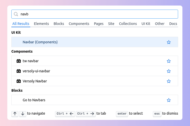
We have added the ability to open a command center using the shortcut CTRL + K.
The command center has 100s of commands that can be searched. It also shows recent commands and allows you to add favourite commands.
Like the shortcut update it will save you from having to click.
The command center makes it possible to not bloat the UI while adding more functionality for power users.
Power user features include wrapping elements in divs and cards.
If you want a command adding feel free to request it.
Shortcuts for Everything
Versoly already included a few shortcuts while editing text and made it easy to copy and paste elements.
As you use Versoly more clicking can waste a lot of time. Shortcuts can speed up the process of building a site while keeping you in flow.
Shortcuts for opening panels like pages (P), adding elements (A) and themeing (T).
You can also navigate around the page using the arrow keys and move elements while holding control.

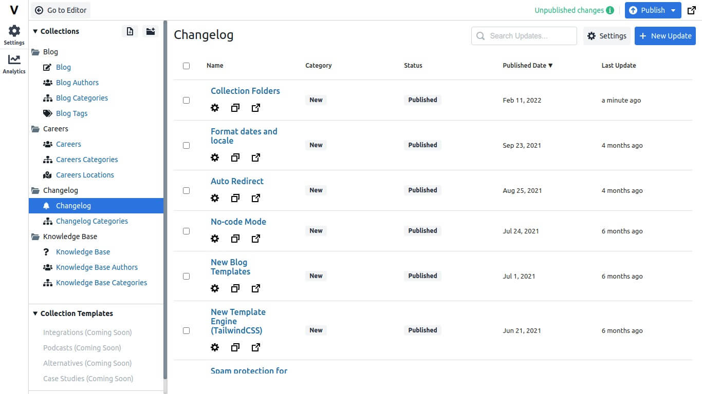
Collection Folders
With the ability to add custom collections the collection list panel can become cluttered.
All sites have now moved over to the new collection folder system.
To update existing sites press the "Update Collection" button.
Format dates and locale
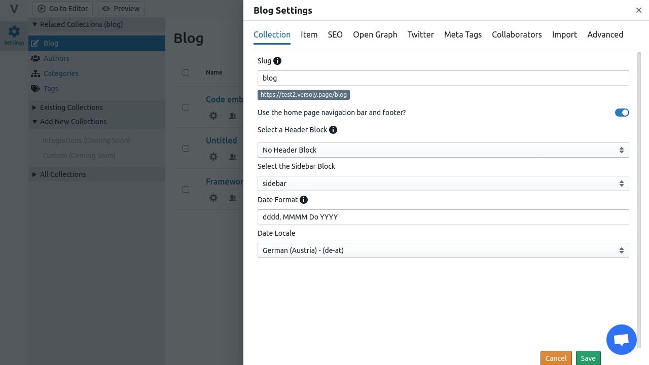
It is now possible to edit all date formats for each CMS.
We use moment.js for our date formatting, it is extremely powerful and you can customise the dates using their formatting style. This cheat sheet from Devhints is a great starting point.
Also the locale can be changed for dates so they use your local language instead of English. We support 130+ locales including French, German and Japanese.
Auto Redirect
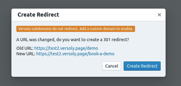
Whenever you change the slug of a page or CMS post, we’ll automatically create a 301 redirect for you.
Visitors and search engines will be redirected to the new slug from the old one. This helps keep your search engine ranking.
You will have the option to cancel or you can remove it later from redirect settings.
No-code Mode
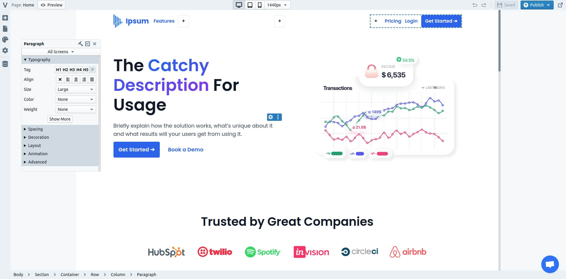
You can now build sites with no-code, we hide a ton of options and automated a lot of processes such as forms and mobile responsiveness.
Flexibility is one core part of Versoly values. You should never be limited to what you can and can't do inside the editor.
We hit that goal a while ago and after talking with customers we noticed that a lot of non-technical customers struggle with building their sites. So this new update should make it a lot easier & less scary to build a website.
The element options sidebar can now be undocked, this is huge if you're using a small screen as you can move it around and hide it while editing text and other content.
We also updated the drag & drop to make it smoother. You can drag any element inside a column and place it inside another column. This helps to keep your pages responsive.
New Blog Templates
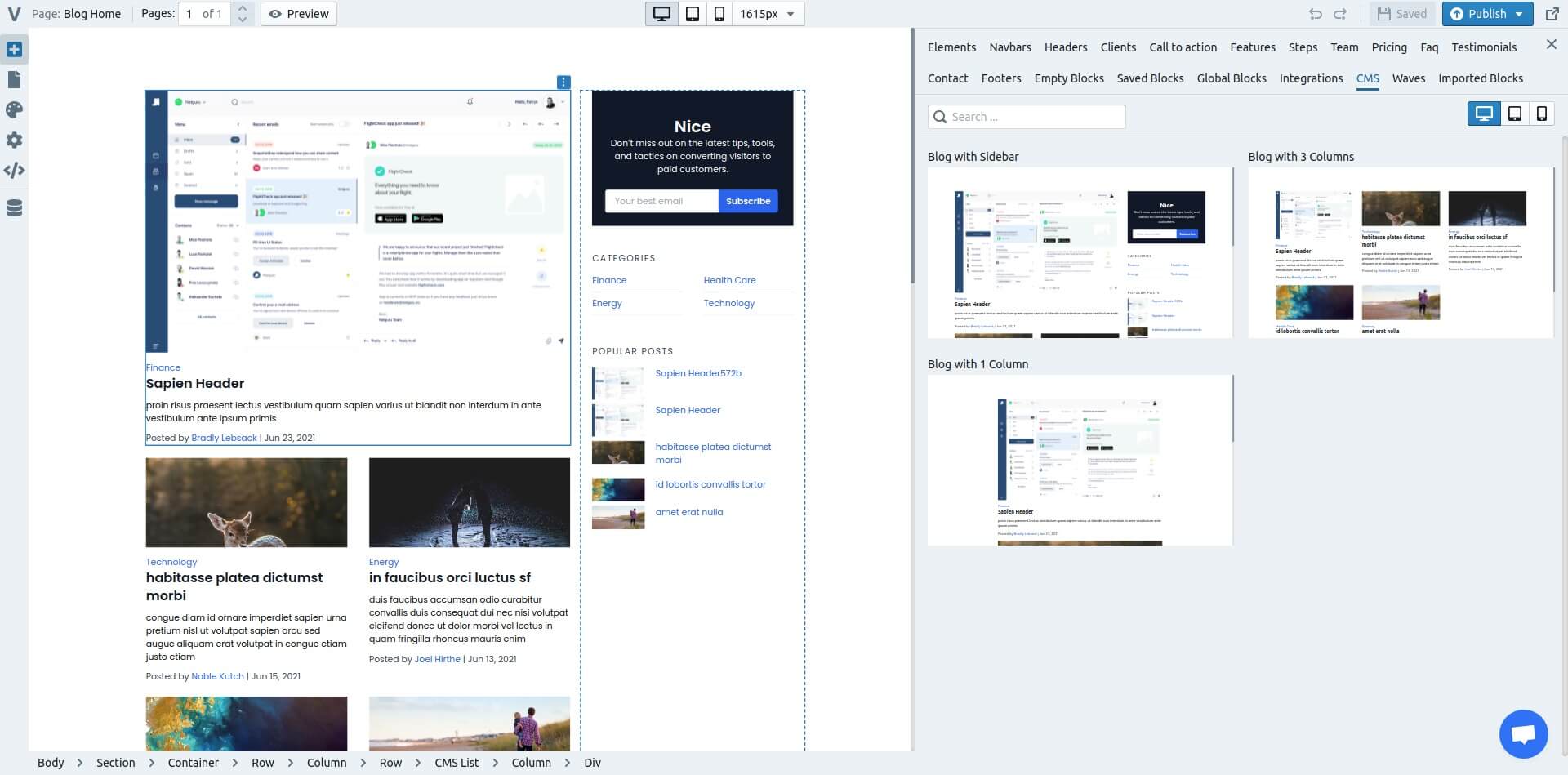
We have just added 1 column and 3 column blog layouts. We also polished up the sidebar layout to make it easier to edit.
It is also now possible to edit the blog card layouts to hide dates, authors and change the font size of headers and text.
We plan on adding more blog layouts in the future. If you love a design feel free to send it in live chat and we might just build it!
New Template Engine (TailwindCSS)
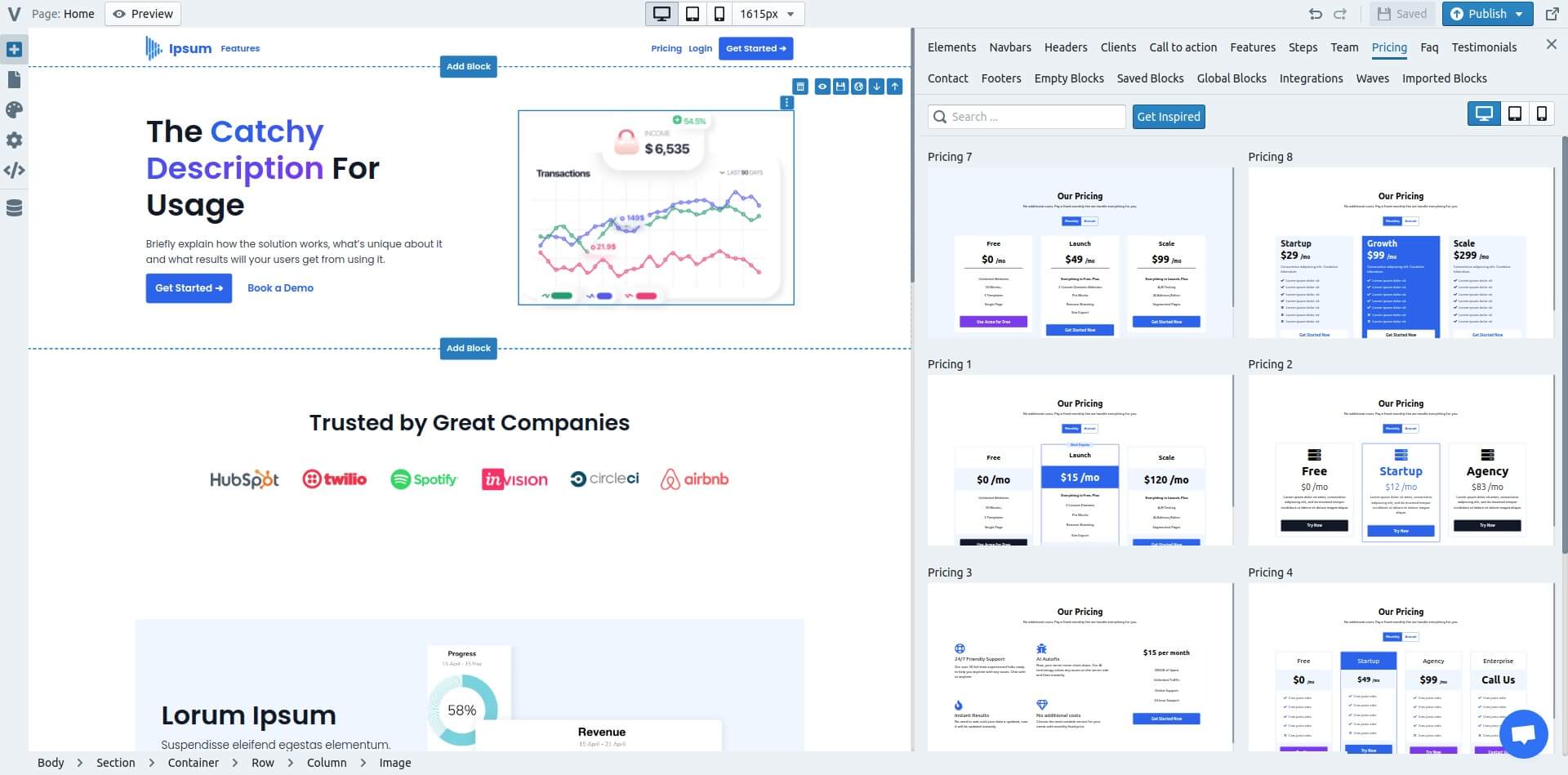
We just added a new template engine based on TailwindCSS. It is 10x more flexible and due to new tech the pages load even faster than our old system (97 vs 100 on mobile).
All the blocks + templates have been updated to the new system and the element options on the side has also been updated. There are more options such as letter spacing, line height and more font sizes.
To get started with the new template engine start a new project. This will give you access to the new templates + blocks.
We plan on adding 100s more templates + blocks so you can build and launch landing pages quicker.
Spam protection for forms
We have added multiple ways to check for spam from forms.
We use timers, honeypots and other backend scripts to check that a form is not spam, but we want to make sure that we don't block legit forms.
We will be continuously improving the spam protection as it's a key feature for Versoly.
To enable spam protection go to your form and on the right hand side you can enable spam protection.
Lazy loading images and videos
Lazy loading can improve page speed and user experience on your website. Browsers recently made it a lot easier to add this functionality without custom code.
To enable lazy loading of images and videos click on the element and then select from the element options on the right hand side.
Copying text from Google Docs and Word improved
Copying and pasting into Versoly from Google Docs and Word worked for most cases, but each platform has different formatting and for complex use cases there would be small issues like extra or no spacing between words especially links.
Those issues have been fixed and a lot of other block types have been optimised such as lists which created a lot of extra formatting. By cleaning the formatting up your page will load faster and will render better on all devices.
Blogging CMS Improvements
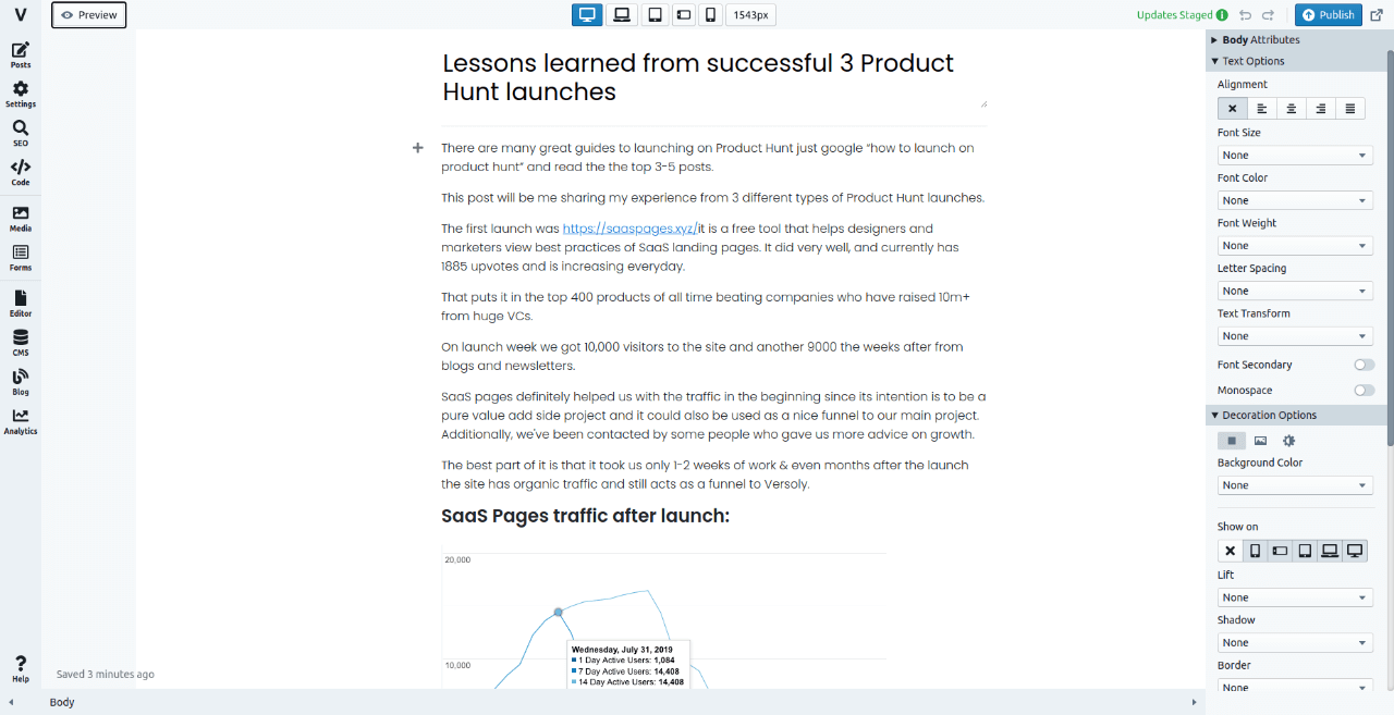
Text Editor Flexibility
We love flexible software so we decided to improve the CMS text editor.
The text editor uses our page editor, so instead of hiding the element options we will now show it. This means you can easily edit everything.
- Different color for text headers? Done
- Extra spacing between a header and a paragraph? 2 clicks
- Animate image as they scroll? Of course
None of these new features will slow your website down as they are built with page speed in mind.
Preview Blog Posts
We wanted to launch the CMS quickly and decided to miss a few quality of life features such as previewing.
In this update we sorted that out. Preview your blog home and blog posts before publishing. That way you know exactly how it looks.
In the next update you will be able to preview knowledge base articles, changelog updates and more advanced blog pages such as categories, tags and authors.
Improved UX
- Changed the add button to open up a better designed modal that makes it easier to add new elements
- Added up and down buttons to quickly move elements around
- Lots of small bug fixes to make the editing experience smoother
Changelog CMS
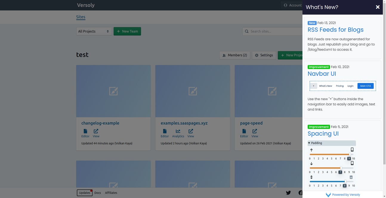
In Versoly 2.0 we added a new core engine that allows us to add "smart" content management systems quickly.
Everything we add to our core engine is automatically added to the changelog CMS. This includes SEO (sitemaps, metatags, pagination), team access, custom design (fonts, navbars, headers, footers) and analytics.
In the future we will add the ability to fully customise the page without code and have multiple templates that fit your brand perfectly.
RSS Feeds for Blogs
RSS Feeds are now autogenerated for blogs. Just republish your blog and go to /blog/feed.xml to access it.
Spacing UI
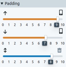
The new spacing UI should make it easier to see the padding and margin of each element by screen size.
