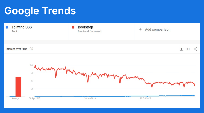
Tailwind CSS has become the default way of styling websites for developers that are early adopters. It also has the highest satisfaction of any CSS framework.
However, it has many areas to improve to increase adoption and create a thriving ecosystem.
These challenges can be overcome but deliberate actions need to be taken by the community.
Areas for improvement
As great as Tailwind is, it is lacking in 3 areas: templates, learning curve and component libraries.
There are a limited number of templates. The most popular is Tailwind UI by the creators, but outside of that there aren’t many templates or template builders. This is an issue as many early stage companies don’t have the resources to build a full UI kit themselves making other options more attractive.
The learning curve is higher than other frameworks like Bootstrap, as it doesn’t come with components like buttons which require hover and focus states or navbars which require JavaScript. It also doesn’t have an easy way to copy a few scripts and style tags and get it working quickly.
Bootstrap and Material UI both have open source packages for native JS, React and Vue. With 20k+ stars developers and 4 million downloads a month they’re extremely popular with developers.
Static sites
Building templates for Tailwind is hard. This is mainly caused by the lack of limitations that other frameworks like Bootstrap have.
For static sites without a JS framework, Builders have to create:
- A custom grid system
- 15+ components
- 35+ buttons with different hover/focus states
- Decide if they should use semantic colors
- Native JS or AlpineJS
- Documentation
This is a large risk for unknown upside as there are not many Tailwind templates. With templates being completely custom, buyers are less likely to buy.
There are some solutions that are close to solving the problem like Daisy UI, which comes with class based components but lacks JS. This makes it hard to adopt for template builders looking to create static site templates.
Flowbite has clean components and JS but lacks class based components, which makes it impossible to use with most static site builders and frameworks - like Django and Rails.
Tailwind UI has no solution for static sites as they stopped supporting Alpine and doubled down on Vue and React. It also doesn’t solve the semantic color issue or documentation.
Versoly UI has nearly solved all the issues for template builders. It comes with class based components based on Bootstrap and native JS for interactive components. It has been battle tested for over a year in the Versoly website builder. We’re also looking into creating an export just for Template builders that will autogenerate documentation and Tailwind code that is obscured, so it can’t be copy pasted.
JavaScript Frameworks
Currently, there are no complete Tailwind CSS frameworks for any JS framework. It is a huge undertaking but not impossible.
Brand new frameworks like Chakra UI exist for React and Vue with 25k+ stars and 1 million downloads. Likewise, the Bootstrap and Material UI frameworks have been built on existing CSS frameworks.
The biggest issue is the Tailwind community is focused around Headless UI but it is lacking a lot of features needed for a complete framework. Purity needs to be sacrificed in the short term to get a working solution.
At Versoly we use Tailwind combined with Mantine + Radix + Versoly UI to create our web app UI. There is a lot of custom code and that creates technical debt. I wish there was a solution like Chakra or Blueprint JS for Tailwind that would stop the constant reinventing of the wheel.
Conclusion: The Solutions
Tailwind has a superpower with its utility classes making extendable components easy to implement while providing sane defaults. That should be leveraged to improve the developer experience.
In the same way just in time mode was introduced and made utility classes even better, they can make the component building better.
We need to create loose constraints for components and semantic colors that will make it easier for frameworks and developers to get started.
It needs to be said that the community could handle criticism better, currently when conflicts arise about Tailwind it seems the default is to say “You don’t understand the power”, “Try it in a project” or label them as a hater and bury one's head in the sand.


